Role : Brand Identity Designer
Tsamis Panagiotis, an established driving school, faced a significant branding challenge. Their existing logo was outdated and no longer resonated with their primary target audience: young, first-time drivers. The strategic goal was to execute a complete brand refresh by designing a new, modern logo that would project an image of professionalism, safety, and contemporary relevance, making the school more appealing to the next generation of students.
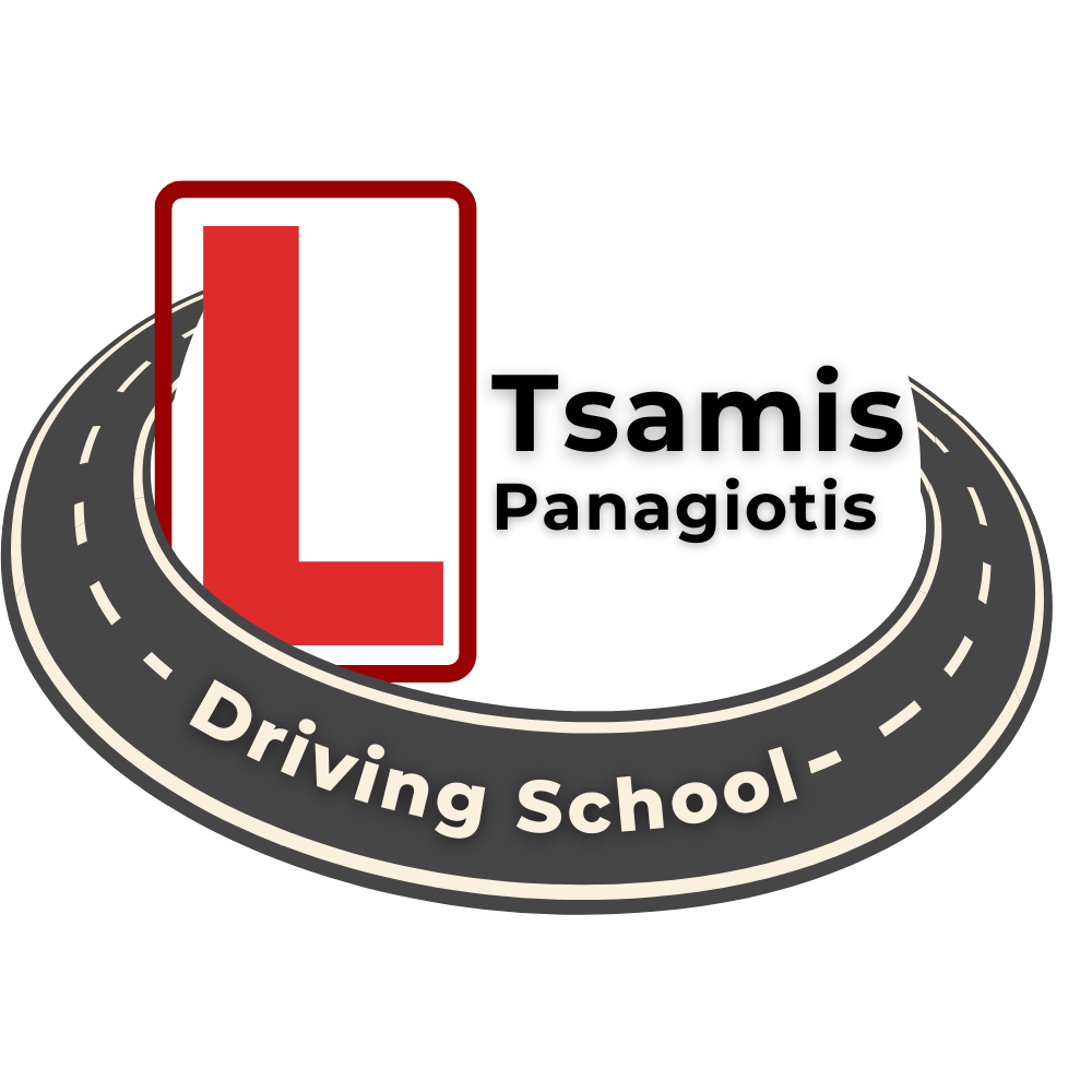
Main Version
My Process
My process was rooted in a deep understanding of both the client's brand and the competitive landscape.
Research & Discovery: I began with a thorough analysis of competitor logos in the local Patras market, as well as an in-depth consultation with the client to understand the core values they wanted the new brand to embody.
Concept & Ideation: Using Adobe Illustrator, I developed ten initial logo variations. The core design concept was to create a clean, memorable mark that was instantly recognizable. The final design features a stylized road that cleverly encircles the letter "L" (Λ), which also represents the international "Learner" plate—a symbol of the student's journey. This dual symbolism creates a meaningful and unique brand mark.
Efficient Revision Cycle: Through clear communication and a strong initial understanding of the client's vision, we were able to progress from ten initial concepts to a final, approved logo in just two rounds of revisions, demonstrating a highly efficient and collaborative design process.

Fully Transparent Version

Alternative Version
Outcome
The client was extremely pleased with the final logo, which successfully modernized their brand identity. The new logo was immediately implemented across all brand assets and played a direct role in attracting new, younger clients to the school. The project was a success not just in delivering a visually appealing design, but in providing a strategic asset that solved a core business problem and contributed to the client's growth.